Brand Story
01
Personality
02
Logo
03
Color
04
Typography
05
Art Direction
06

Introduction
For decades, the residents of Tel Mond have had a simple choice: drive to the city for a drink, or stay home. 4.8 is the end of that compromise. we are the first true cocktail bar in the neighborhood - a milestone for the community and a "third place" for the locals.
These guidelines exist to ensure that as we grow, we stay true to our roots. Whether on a coaster, an Instagram post, or a wall mural, the "48" brand must always feel like it belongs here
Contents
01 Brand Strategy
02 Personality
03 Logo
04 Color
05 Typography
06 Art Direction
01 Brand Story
4.8 was born from a return to basics.
Founded by Noam, a former professional bartender who spent years in the high-tech industry, the bar represents a shift from the digital back to the manual.
It is a rejection of corporate sterility in favor of human warmth. We serve high-end cocktails, but we do it without the white gloves

02 Personality
Our internal motto is "Not Enthusiastic."
This doesn't mean we don't care - it means we don't try too hard to impress.
We don't use buzzwords. We don't do gimmicks. We are effortless

Tone & Voice
Our voice is the verbal equivalent of our logo: Bold, solid, but human. We speak like Noam - a professional who has seen it all and doesn't need to shout to get attention. We are the opposite of "Salesy." We are "Dugri"
Sample Copy
Finally Local
Cocktails. Friends. 48
Drink Local
Your 48
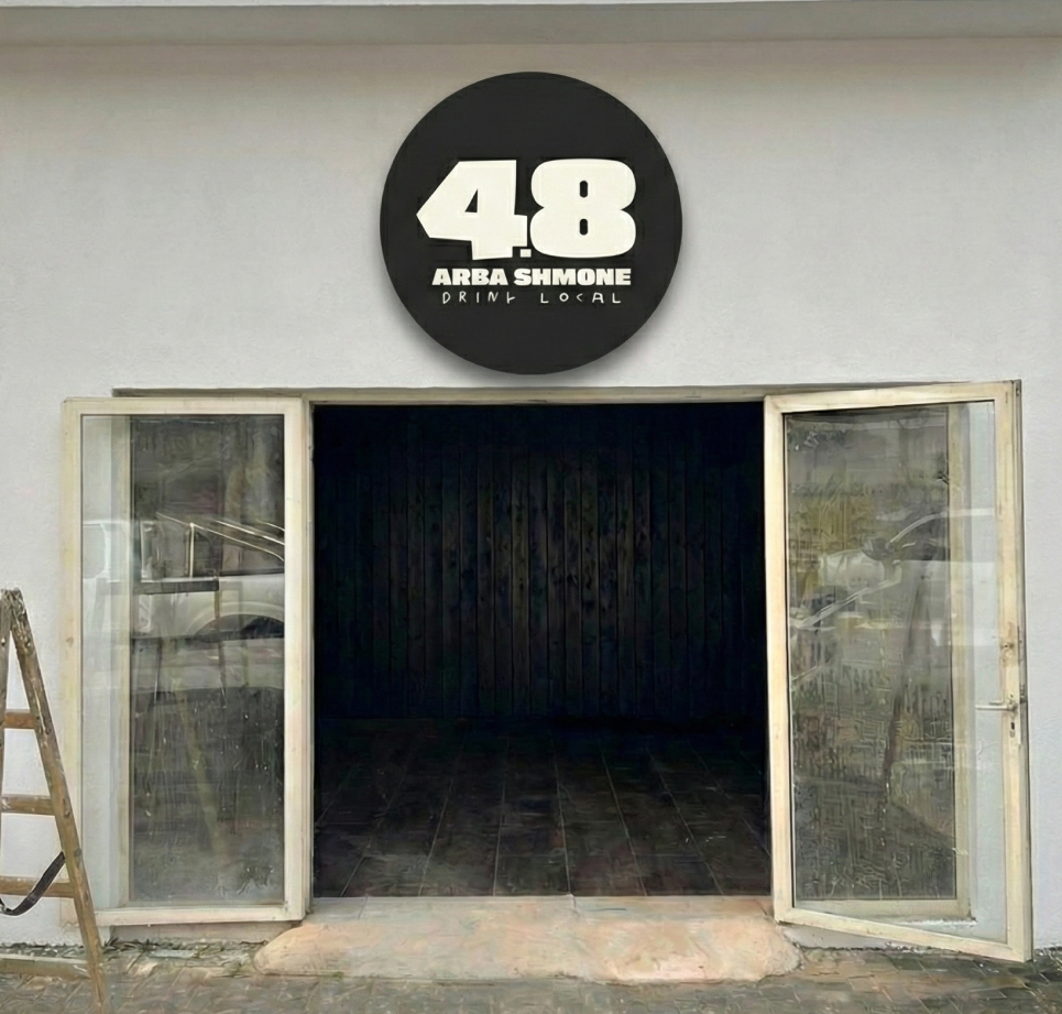
03 Logo
The 48 logo serves as the unapologetic anchor of the brand's visual identity.
Set in the heavy, industrial 'Asphalt Black Condensed' typeface, the geometric mark is designed to command space without needing to shout.
Stripped of any unnecessary containers or borders, this solid, permanent structure stands in deliberate contrast to the brand's messy, handwritten 'ink' elements, perfectly capturing the effortless, unpretentious vibe of the neighborhood."
Primary Lockup


04 Color
The color palette of 48 is intentionally grounded and mature, perfectly balancing industrial weight with inviting warmth. Relying on three core shades, it completely avoids "enthusiastic" or flashy neon colors:
The Asphalt (#262626): A deep, rich charcoal rather than a harsh digital pure black. It provides the necessary urban edge, serving as the heavy anchor for the primary typography and logo.
The Canvas (#F7F5E9): A warm, unbleached off - white. By replacing sterile white, it gives the menus and digital backgrounds the analog, tactile warmth of raw paper, instantly communicating the cozy, "living room" vibe.
The Local Touch (#2E493B): A sophisticated deep moss green. This adds a subtle layer of depth and elegance without being loud. It gently nods to the agricultural roots of the Sharon region while pairing beautifully with the dark, moody lighting of a cocktail bar.
Together, these colors quietly set the mood without demanding attention, perfectly executing the "unpretentious excellence" the brand stands for
Primary Palette
The Asphalt
Hex: #262626
The Local Touch
Hex: #2E493B
The Canvas
Hex: #F7F5E9
05 Typography

The typographic system of 4.8 is based on a deliberate tension between stable structure and human spontaneity, perfectly aligning with our "Asphalt & Ink" concept. Serving as the primary anchor is the heavy, dominant Asphalt font, which projects a blunt, unapologetic, and industrial presence for the logo and main headlines. To break this rigidity and introduce our signature "effortless," intimate, and neighborhood vibe, we integrate handwritten style fonts - Kiya Handwrite in English and Pil Kachol in Hebrew - used for cocktail names and personal side notes, giving the brand its soul. Finally, to maintain readability and precision (mirroring Noam's professional standard behind the bar), technical information like drink ingredients and prices is displayed in the clean, minimalist Helvetica Neue Light and Galil Light fonts. This combination creates a highly contrasted typography that feels established and serious on one hand, yet completely eye-level and unpretentious on the other
Primary Typeface
Asphalt
Secondary Typeface
Kiya Handwrite
Secondary Typeface
Helvetica Neue Light
Secondary Typeface
גליל לייט
Secondary Typeface
פיל כחול
Menu
The menu design for 48 abandons the stiff, corporate brochure look in favor of an authentic, local 'zine' aesthetic. Embracing our "Not Enthusiastic" ethos, it features rough, hand-drawn illustrations of glassware rather than polished, pretentious photography. The content itself acts as a conversation with the neighborhood, highlighting deeply personal touches like the signature "10 Years Too Late" cocktail a witty nod to Noam's high - tech hiatus and drinks named directly after friends and locals, like Adi and Itamar. By presenting high - end mixology in such a raw, accessible format, the menu perfectly bridges the gap between professional quality and our effortless, "living room" vibe.

06 Art Direction
Rejecting the glossy, staged, and perfectly lit aesthetic typical of high end mixology bars, we use grainy, high contrast black and white imagery that feels like it was captured on a disposable camera during a great night out. The focus is entirely on honest, candid moments the texture of condensation on a cold pint glass, the blur of a bartender shaking a drink, genuine laughter between friends, and the unglamorous, manual reality of cracking eggs for a cocktail.
This gritty, flash photography style perfectly captures our "Not Enthusiastic" ethos and the "Asphalt" side of the brand. It proves that we care deeply about the craft of the drink and the reality of the neighborhood, but we don't feel the need to show off or artificially dress it up. It is intimate, nostalgic, and unmistakably real.


Design language
The design language of 48 is the ultimate realization of our "Asphalt & Ink" concept, bringing all the brand elements together into a cohesive, unpolished 'zine' aesthetic.
It heavily relies on asymmetrical, organic layouts where raw, black-and-white documentary photography serves as the backdrop for stark typographic contrasts. By boldly layering heavy, blocky "Asphalt" headlines over messy, handwritten notes and hand-drawn illustrations like the pouring hands or the sketch of the bar's exterior the brand feels tactile, spontaneous, and deeply personal.
Instead of relying on rigid, sterile grids or corporate polish, the posters and social media assets look like indie gig posters or local community flyers. This visual language perfectly communicates the "Not Enthusiastic" vibe: it’s effortlessly cool, firmly rooted in the neighborhood, and completely free of pretension.
Illustrative
The illustrative language of 48 acts as the 'Ink' to our 'Asphalt.' Rejecting polished, corporate vector graphics, the brand relies on raw, hand-drawn sketches to communicate its 'Not Enthusiastic' and unpretentious vibe. Featuring quick, unrefined doodles of glassware, pouring hands, and the bar's physical exterior, the illustrations feel spontaneous and deeply manual. This messy, zine-like approach perfectly breaks the rigidity of the heavy industrial typography, adding a layer of human warmth and making the high-end cocktail experience feel accessible and distinctly local


Ori Mor All Rights Reserved